About

Portfolio

Services
I am a designer and I enjoy what I do.
Welcome to my creative corner! I'm Val Sorensen, a graphic designer who has proudly called Nashville home for the past decade. Balancing my passion for design with the joys of family life, I am a dedicated husband to my wonderful wife and a proud parent to three vibrant girls and one spirited boy (finally!). With over eight years of professional design experience, I've had the privilege of transforming ideas into visual narratives that captivate and resonate. This portfolio is a curated collection of my creative journey, showcasing my commitment to delivering impactful and visually compelling design solutions.
Explore and enjoy!
I would love to hear from you! If you see something you like please reach out and lets work together to create something amazing!
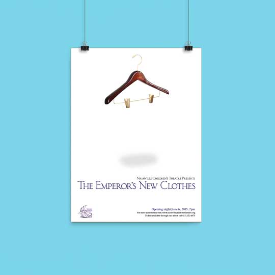
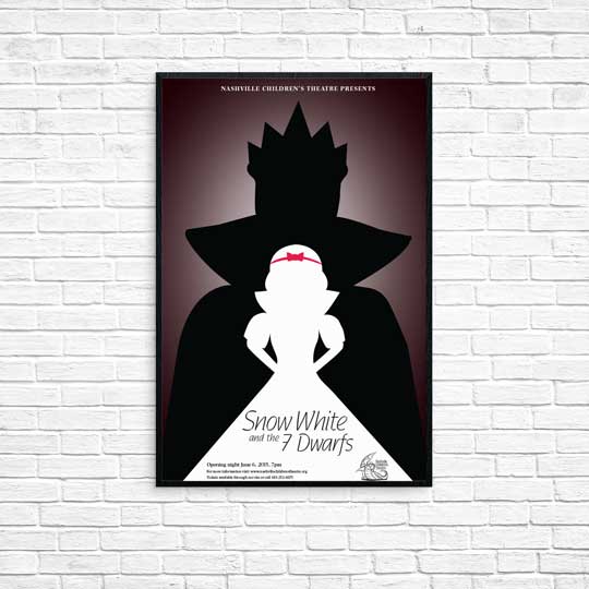
Designed for the Nashville Children's Theater, the goal behind this design was to attract the children but also engage adults. Designed and Illustrated from scratch.
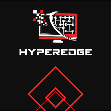
This modern powerpoint template was designed for HyperEDGE to pick and choose content and cater a presentation to each of their individual clients.
LIVE PREVIEW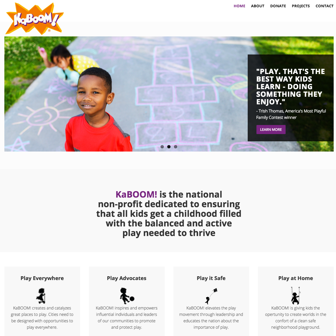
This website was designed as a project and is not the official KaBOOM website. KaBOOM! is the national non-profit dedicated to ensuring that all kids get a childhood filled with the balanced and active play needed to thrive. Redesigned the website to make it fully responsive and mobile friendly.
LIVE PREVIEW
National Grid was needing a presentation deck to inform their clientele of their new Smart Meter roll out initiative.
LIVE PREVIEWDesigned for the Nashville Children's Theater, the goal behind this design was to attract the children but also engage adults. Designed and Illustrated from scratch. Main goal was to minimize design but expand the concept.
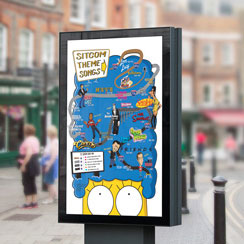
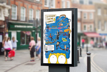
This corky illustrated inforgraphic is to easily show the time line and transformation of TV sitcom theme songs throughout history. After Meeting the Flintstones, the painless suicide at the 4077th MASH, and then moving on up with the Jefferson's, this graphic will take you through some of the funniest moments in TV history.
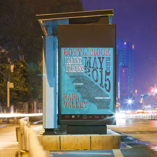
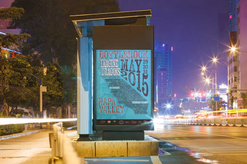
The Bottlerock Festival is a yearly 5 day music festival in Napa Valley California. Music enthusiasts come from all over the world to experience the splendor of the Bottlerock Festival. Typography really drives this design. Main focus was typesetting and interactive type.
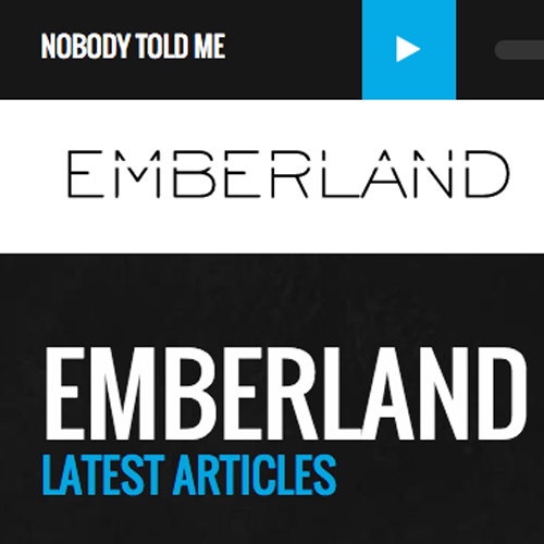
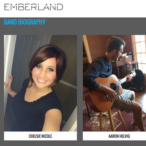
Emberland is an new folk-pop duo up and coming in Nashville, TN. This website is designed to showcase the music and talent of Chelsie Nicole. Website is coded in HTML5 and CSS3, busing a bootstrap outline. Main goal was to incorporate a floating music player with the navbar.
LIVE PREVIEW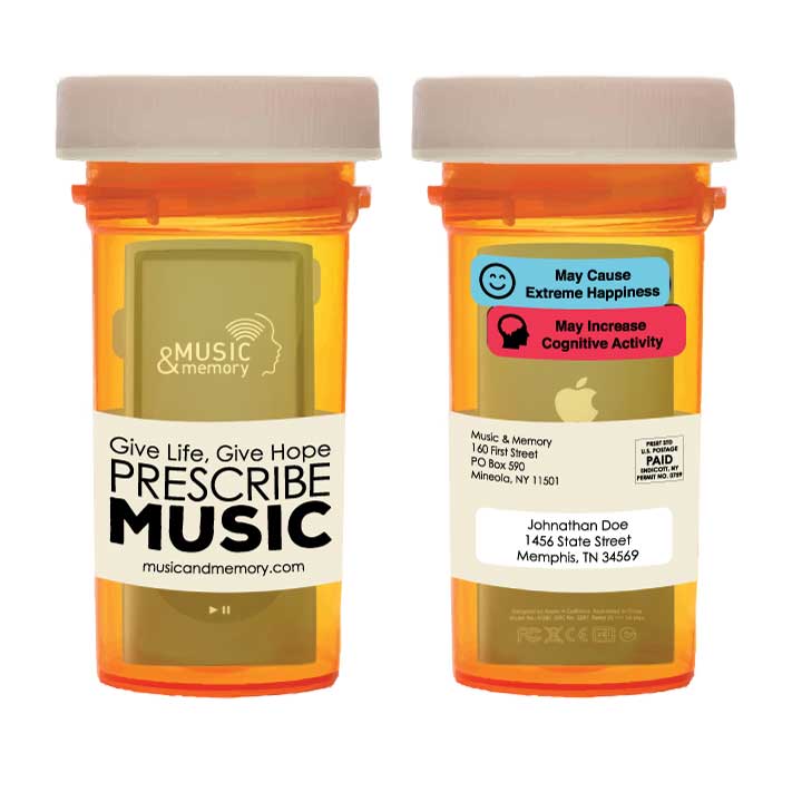
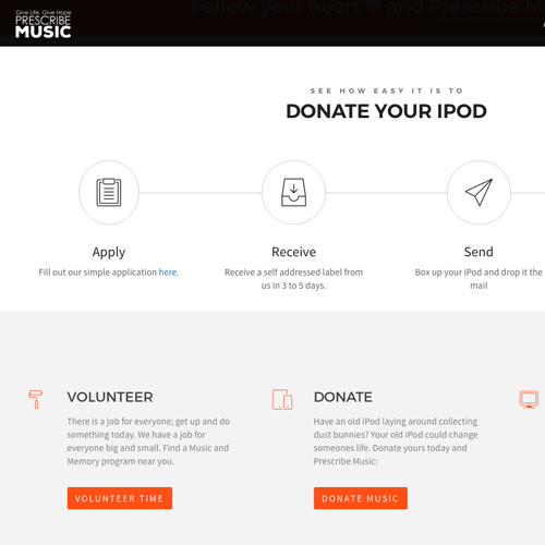
A Print and Web campaign to increase public awareness to the Music and Memory Foundation and how music is a viable treatment option for Dementia and Altzimers patients.
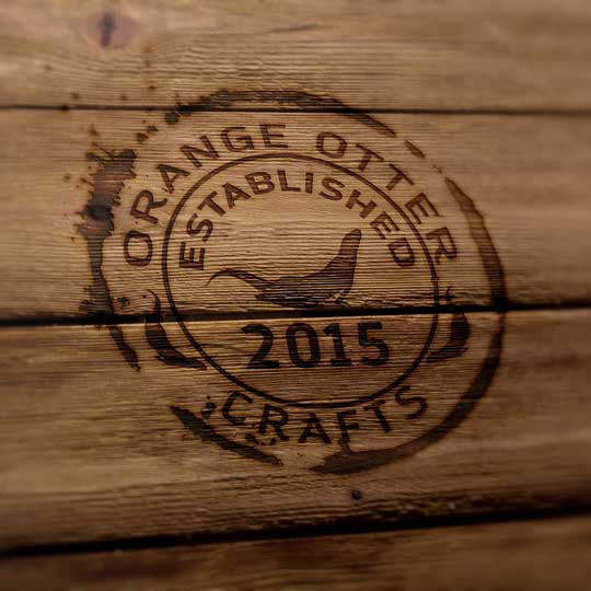
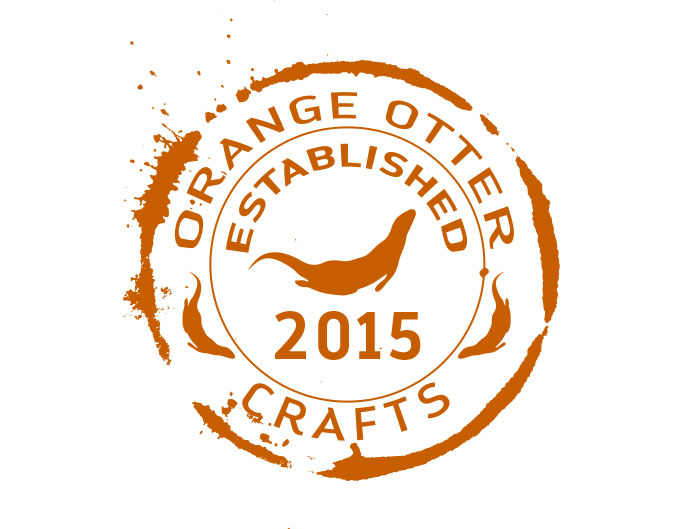
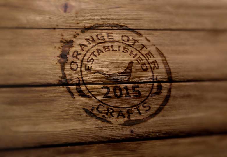
This signature was created for an Etsy shop that creates greeting cards, stamps and letters. Check out the Orange Otter Crafts shop. The client wanted an otter in a emblemed circle with a slight grunge.
View the Site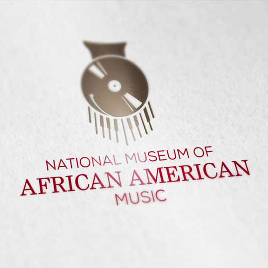
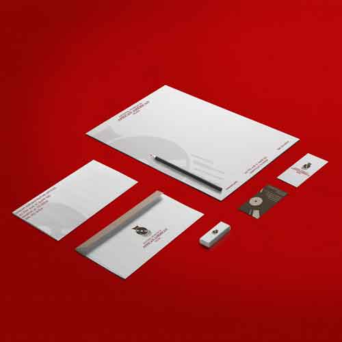
The National Museum of African American Music is a new installment coming to Nashville, TN. This identity package was mocked up for the Museum. Logo and stationery elements were designed and created with the potential brand in mind.
View the Site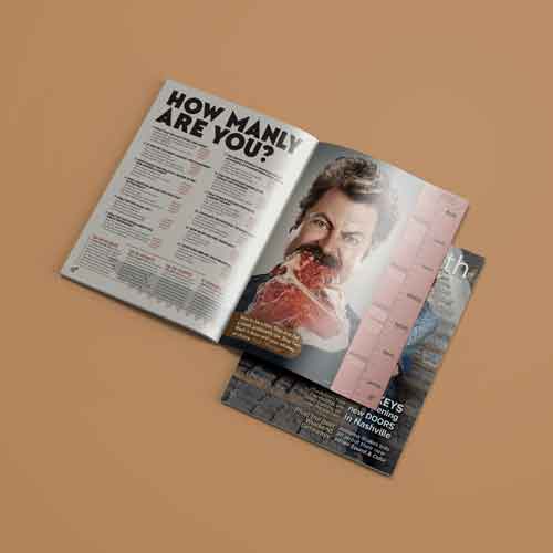
This is a fictitious magazine created to explore all things manly. Most of the content was sourced from 3rd parties Online and cited. All layout, typesetting, image manipulation and overall design were done by the author.
Full Magazine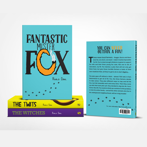
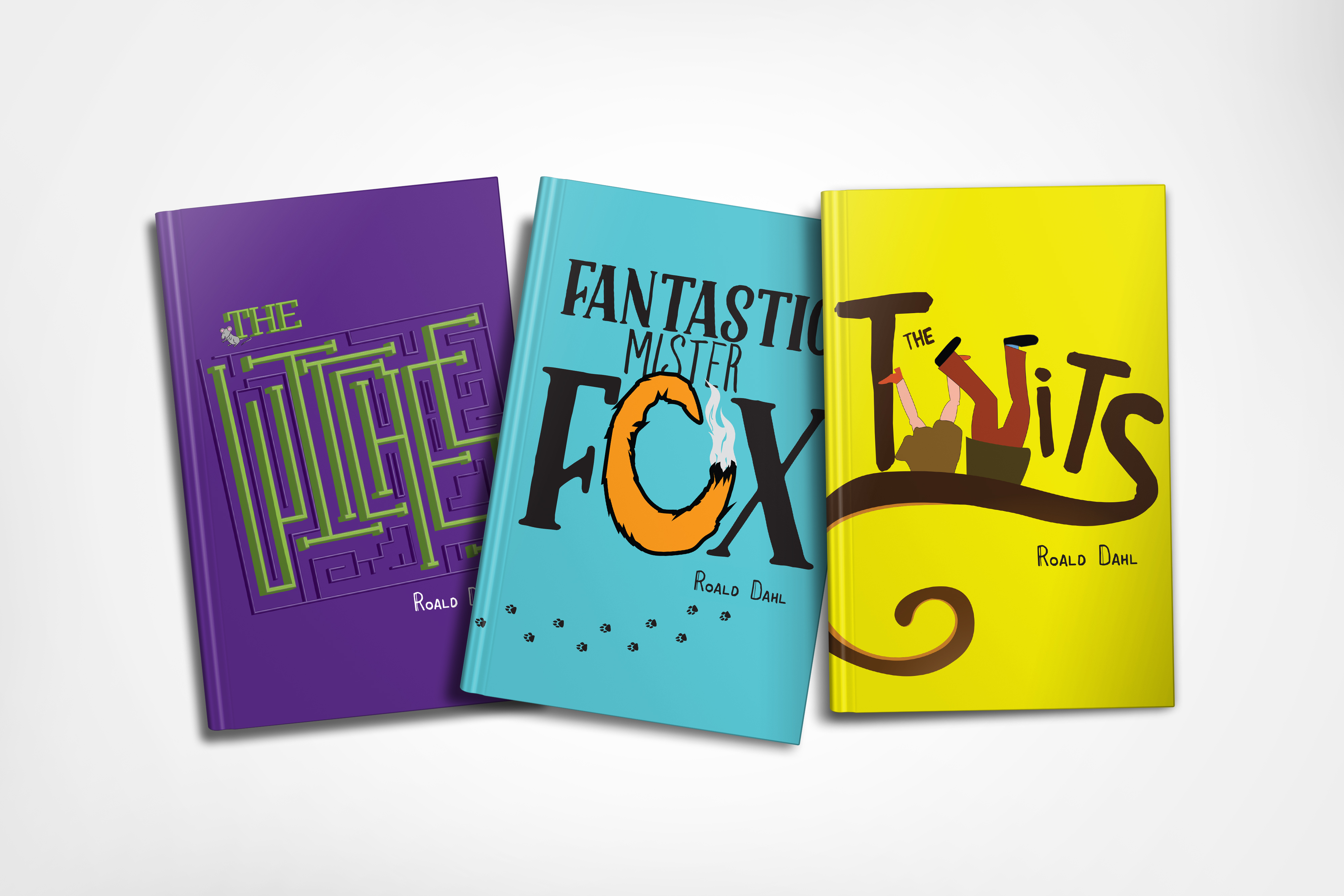
A creative recreation of 3 classic books from beloved children's author Roald Dahl. Type driven covers were designed for Fantastic Mr. Fox, The Twits, and The Witches.
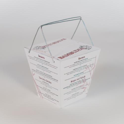
This is a fictitious menu created for a Chinese restaurant. The concept behind this menu was a practical and clean display of the ingredients on a traditional takeout box. Although some of the recipes were taken from restaurants already in existence, the concept, design and packaging was all original for this project.
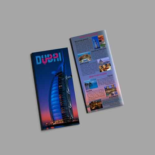
Dubai is a one-of-a-kind place to visit. This brochure is a handy travel companion that scratches the surface of things to do, places to see, places to stay, and places to eat.
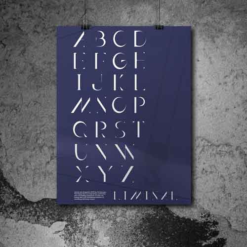
Liminal was designed in 2015 by Val Sorensen. This display font was inspired by construction sites and building equipment. It is the raw beauty that is the foundational skeleton of something still being created.

Give Life, Give Hope, Prescribe Music. This Prescribe Music campaign was designed for the Music and Memory non profit organization to increase public awareness. The concept behind this project is to increase public awareness of music and how it can improve the quality of life for dementia and Alzheimer's patients.
Live Preview
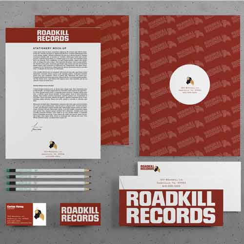
The Roadkill Record logo and identity packaged was created from scratch for a fictitious record company in Nashville, TN.
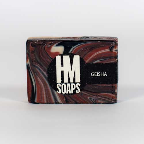
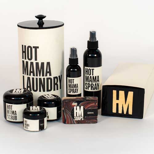
Hot Momma is a local soap connesour who was looking for a re-brand. This simple packaging approach is to juxtapose the clean and organic nature of the soap, scrubs and sprays.
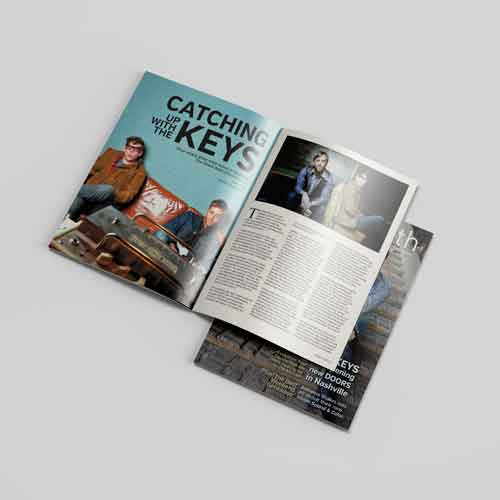
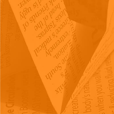
The Urban South Magazine went through a complete overhaul to redesign and update all the graphics and content. Although the content was all given, the layout, design, and typography is all original.
Full Magazine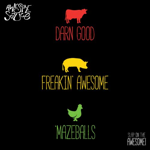
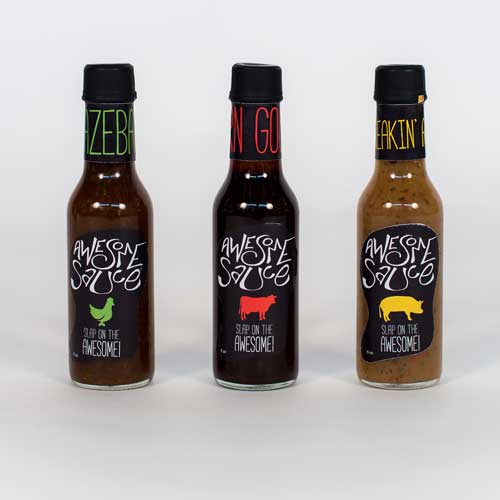
Look out Saracha there is a new "favorite" sauce coming to town. Check out 'Mazeballs, Darn Good, and Freakin' Awesome labels designed, and illustraited by hand.
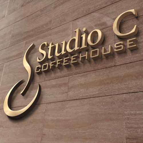
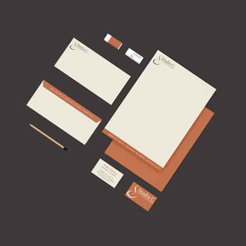
Studio C was a whole branding campaign from scratch; logo, stationery, identity manual, environmental graphics, dishware, and merchandise.

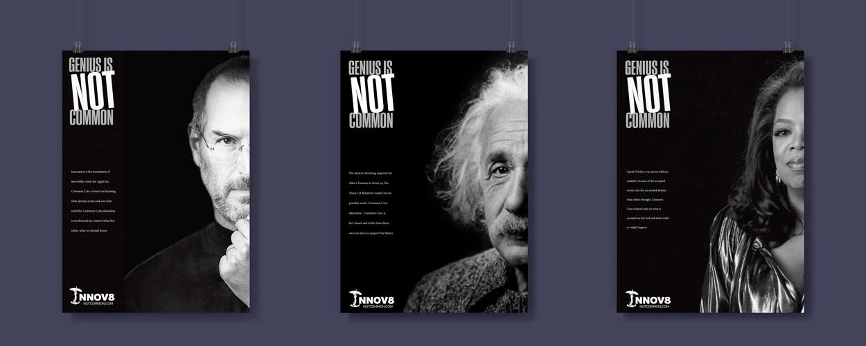
Genius is not common was designed for INNOV8 as a public ad campaign against common core.
Posters, layouts, logo designs, corporate letterheads, business cards, corporate branding
Presentation Design, design consultation, printing solutions, conceptual design, re-branding, redesigning.
Microsoft 365, Powerpoint, Pitch Decks, Brand guidlines, Corporate All hands, Town halls, powerpoint templates